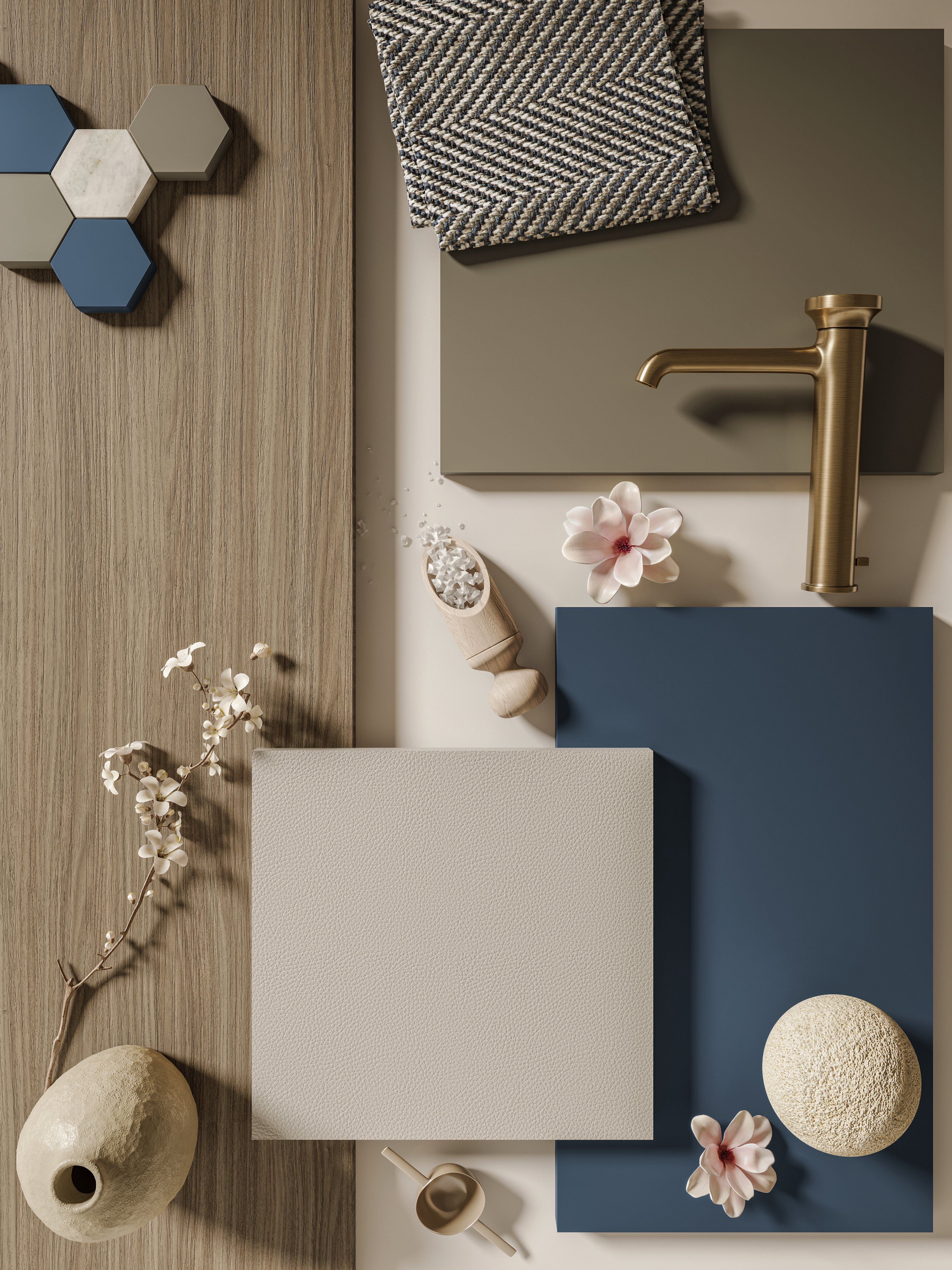
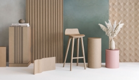
Wellbeing Spaces
In today’s interiors, beauty and wellbeing go hand in hand. More than ever, people seek surfaces that are not only visually appealing but also mentally supportive, reducing visual fatigue, promoting focus, and enhancing the quality of time spent between home and work.
Vision surfaces were created for this very purpose: materials, colors, and textures designed to bring balance and sensitivity into everyday life. Each finish fosters visual harmony, mental clarity, and emotional connection with the space.
✨ Why it matters:
Design has a new mission — to help us feel better.
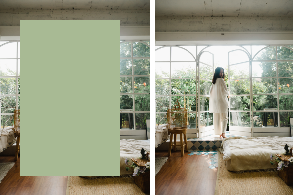
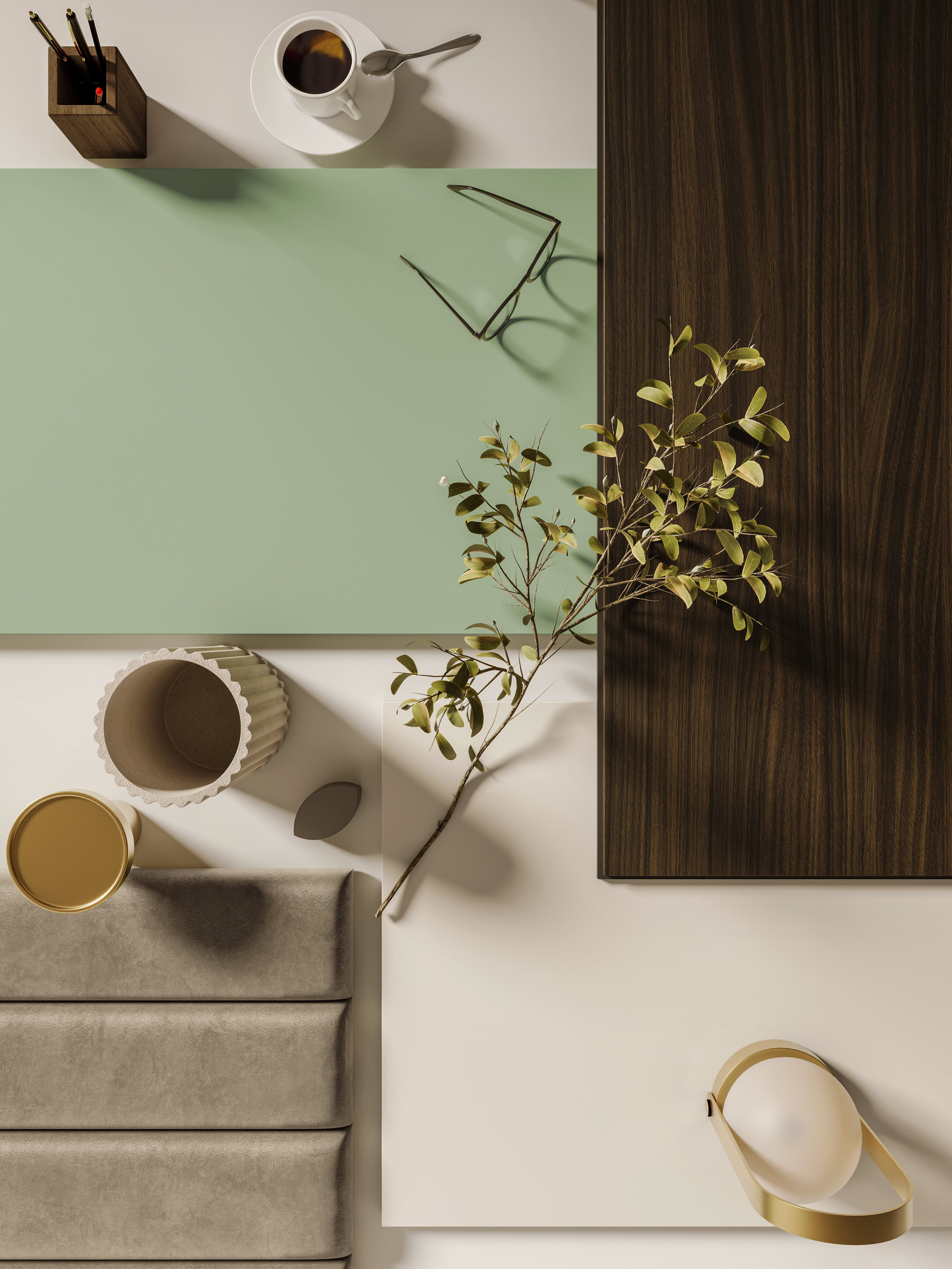
Sage Green | D263 – Vision
Visual Calm & Botanical Tones
Sage Green is a soft, nature-inspired hue that encourages calm and focus. Its gentle tone helps create balanced, tidy environments that support thinking without overwhelming the eye.
✔️ Ideal for: desks, room dividers, wall panels
✔️ Pair with: warm woods, light sands, soft greys
✔️ Keywords: balance, serenity, clarity
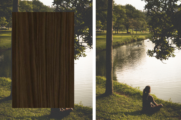
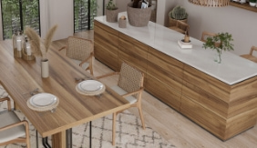
Tonale Walnut | A613 – Vision
Natural Contrast & Functional Elegance
Tonale Walnut is a deep, elegant wood with a smooth, regular grain. It communicates strength and character, making it perfect for adding structure and visual contrast to interiors—without sacrificing warmth.
✔️ Ideal for: bookshelves, storage units, worktops
✔️ Pair with: neutrals, sand tones, Sage Green
✔️ Keywords: structure, depth, harmony
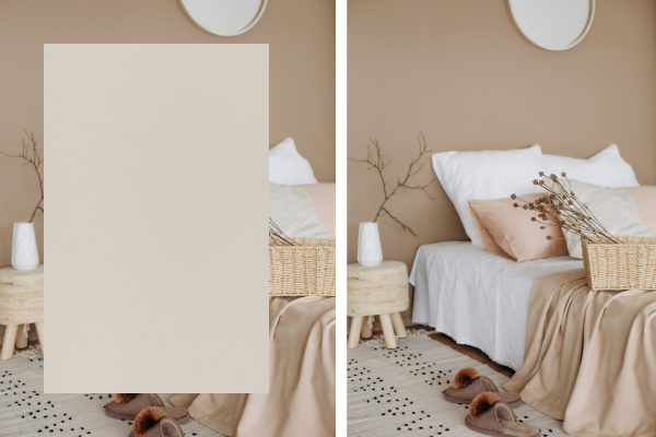
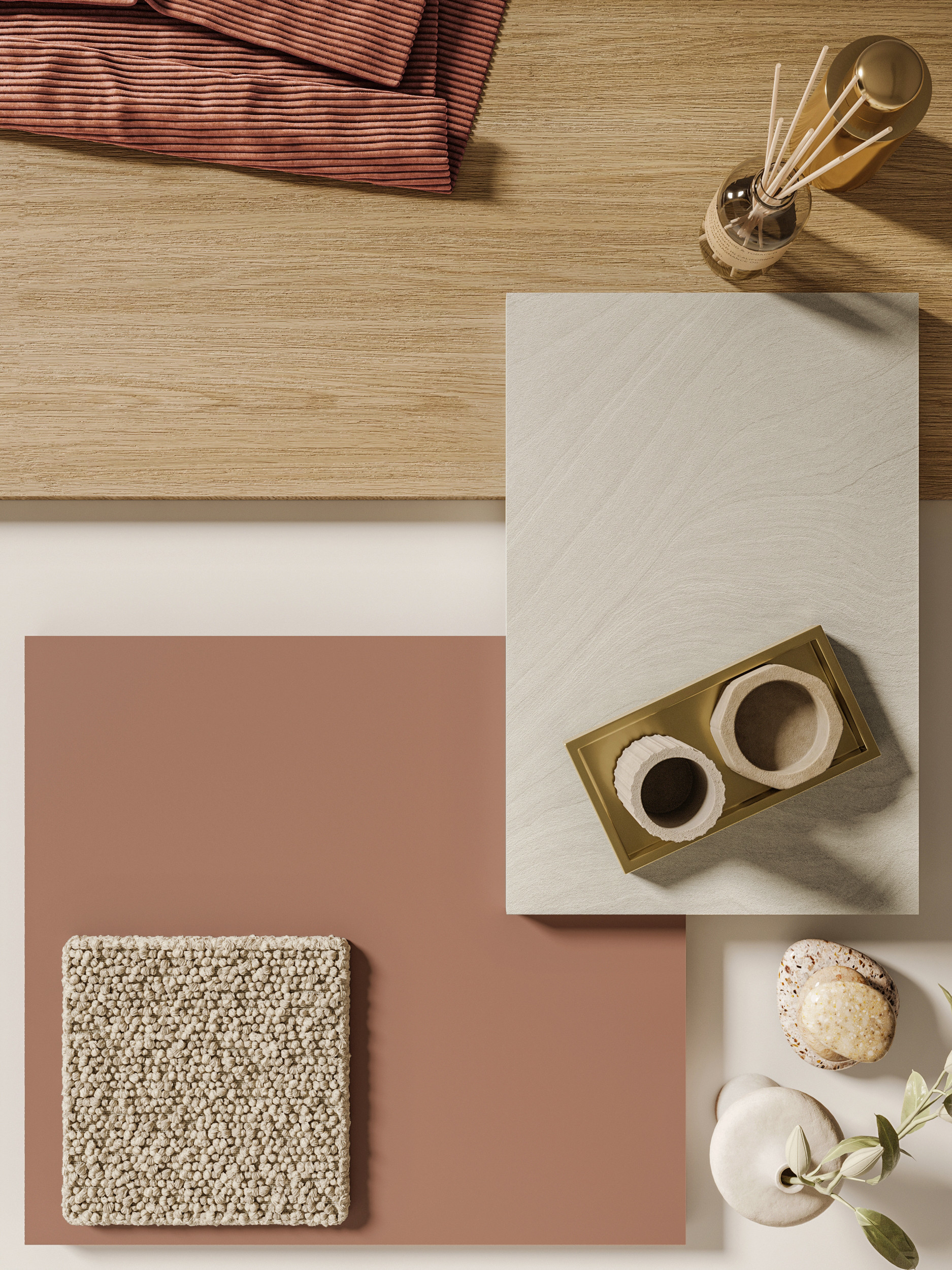
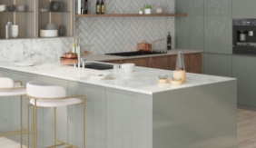
Canapa | D266 – Vision
Tactile Neutrals & Soft Texture
Canapa is a light, natural finish inspired by raw fiber. With its soft appearance and neutral tone, it enhances light diffusion and creates a sense of airiness and order, perfect for peaceful, uncluttered environments.
✔️ Ideal for: cabinets, countertops, walls, small spaces
✔️ Pair with: mid-tone woods, desaturated colors
✔️ Keywords: light, versatility, visual silence